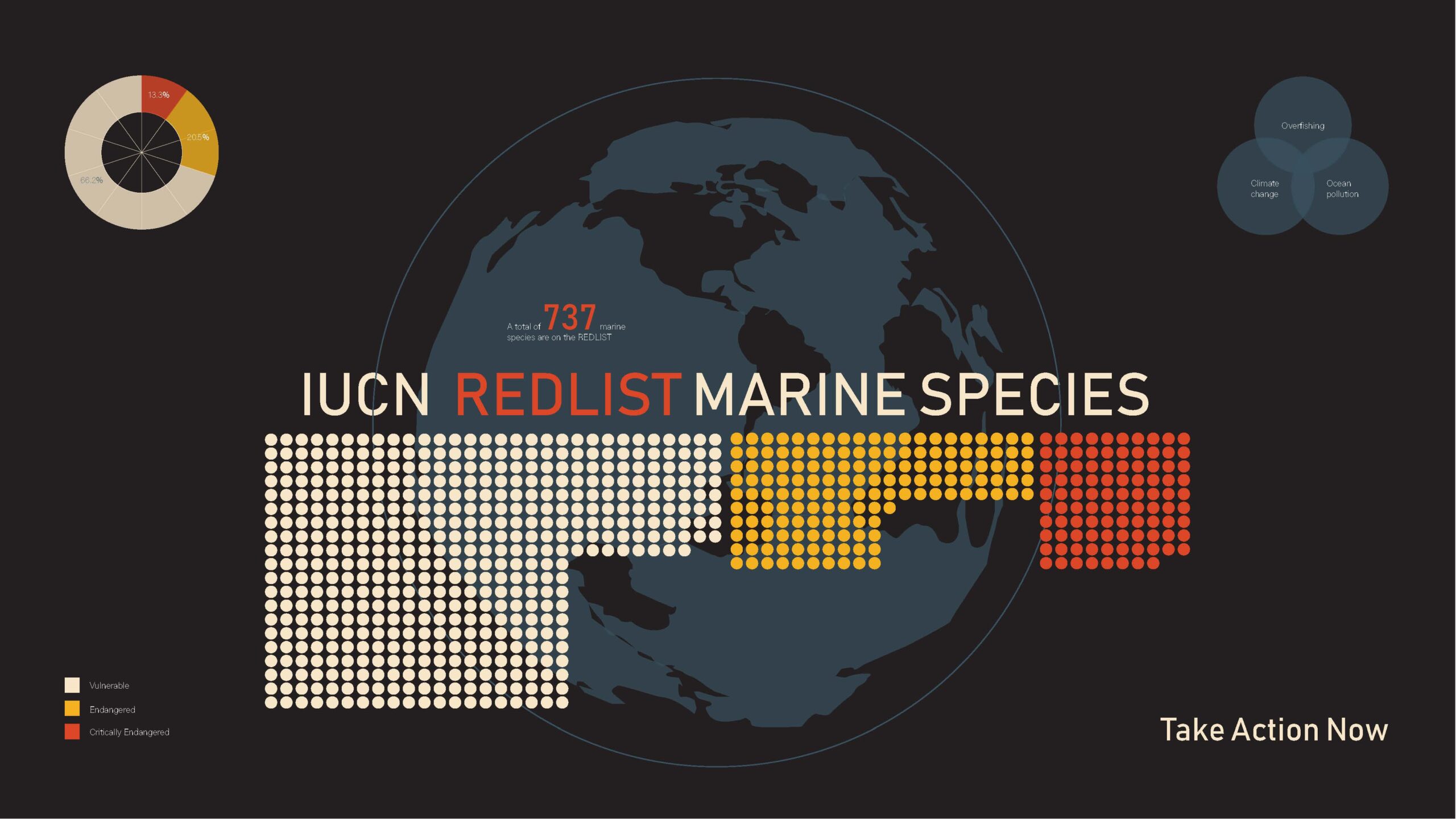
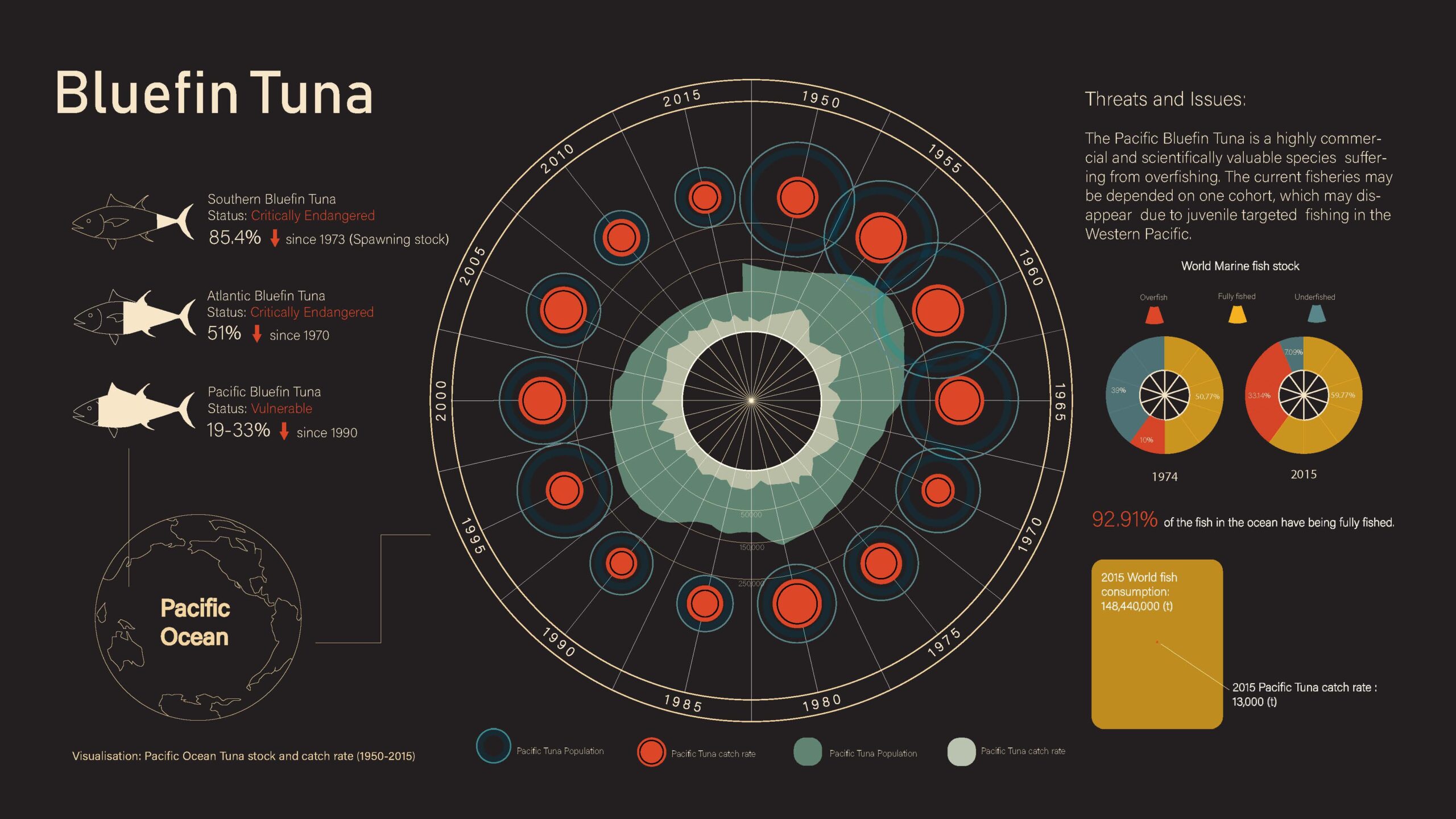
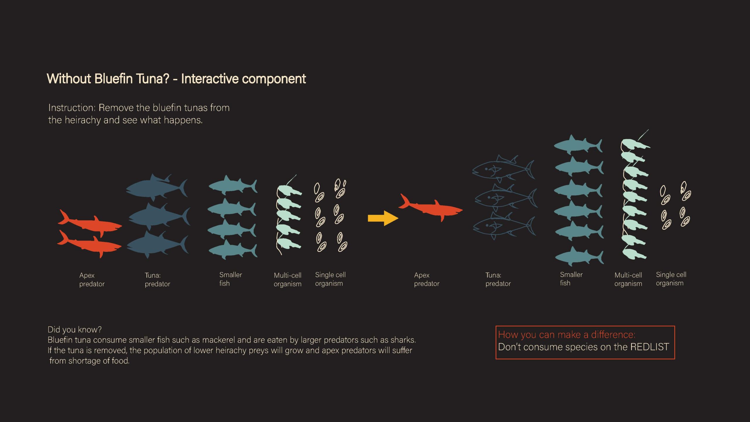
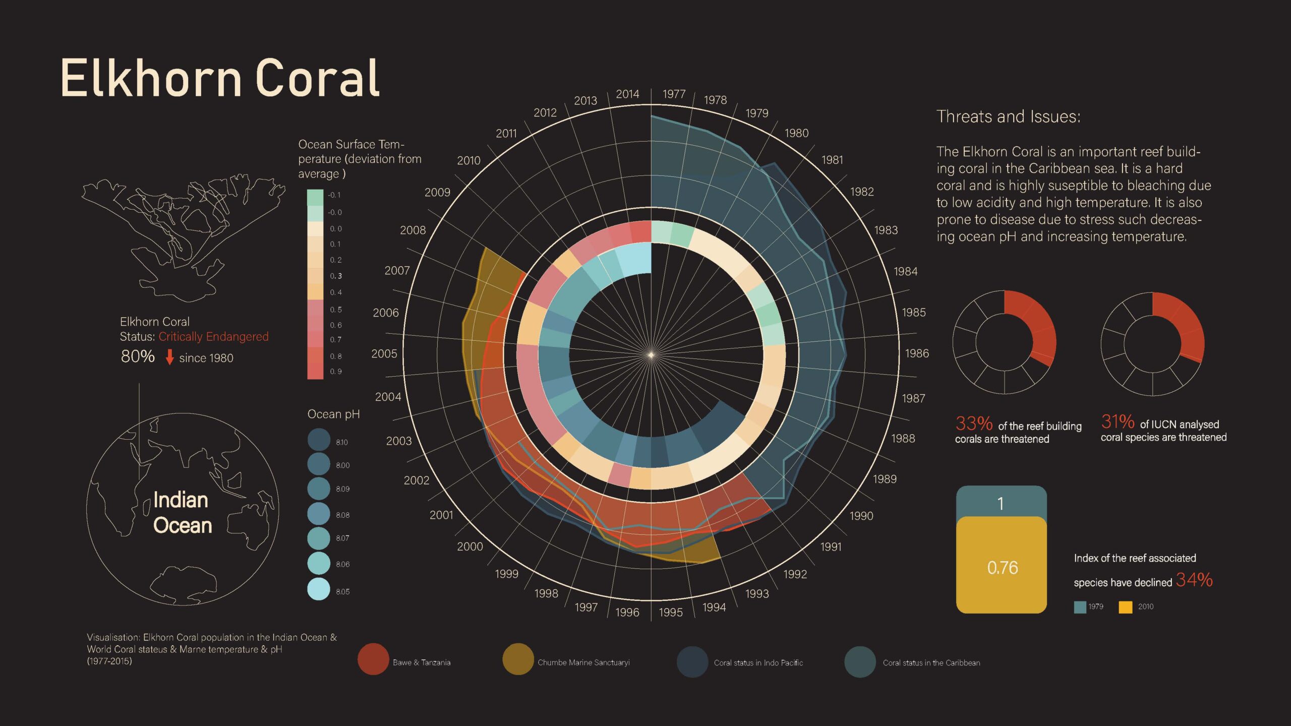
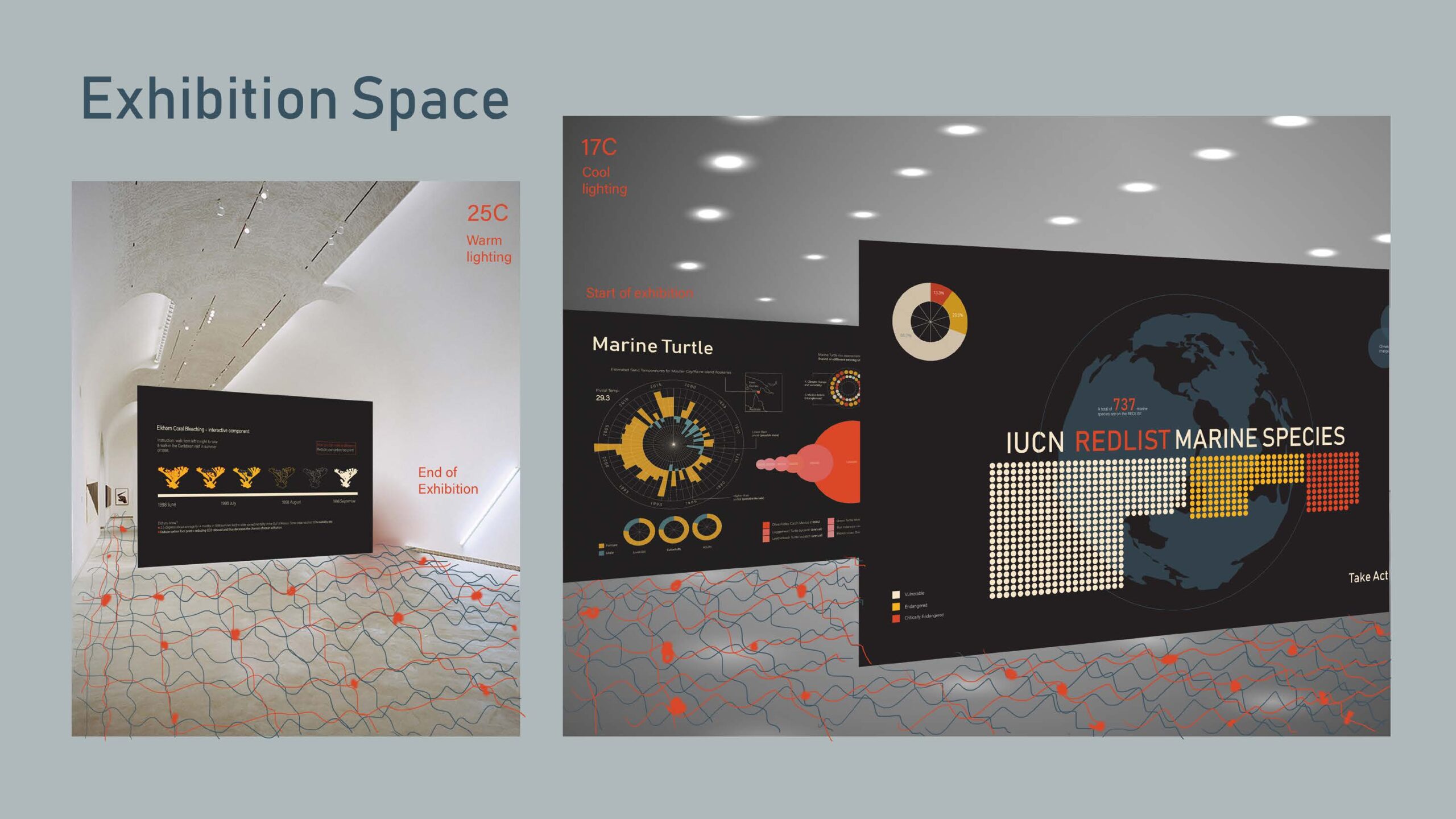
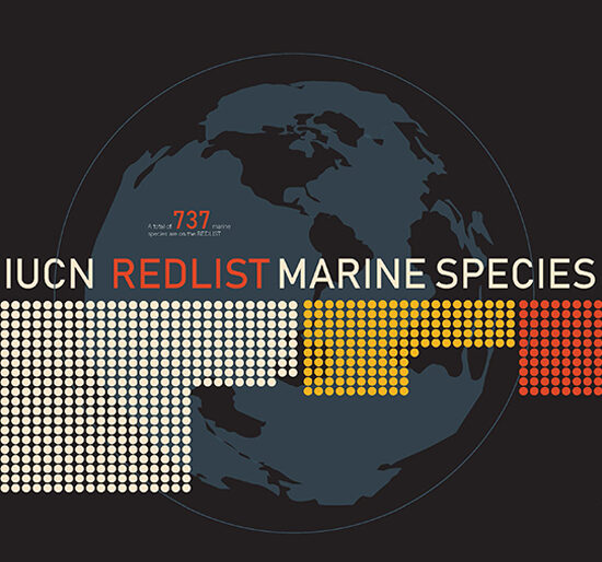
Marine Species Data Visualisation was a learning research project. I want to visually explore how the current population of the marine animal species have changed since the 1950s.
Category
Graphic Design
Tags
Data Visualisation, Exhibition Design, Adobe Illustrator, Research
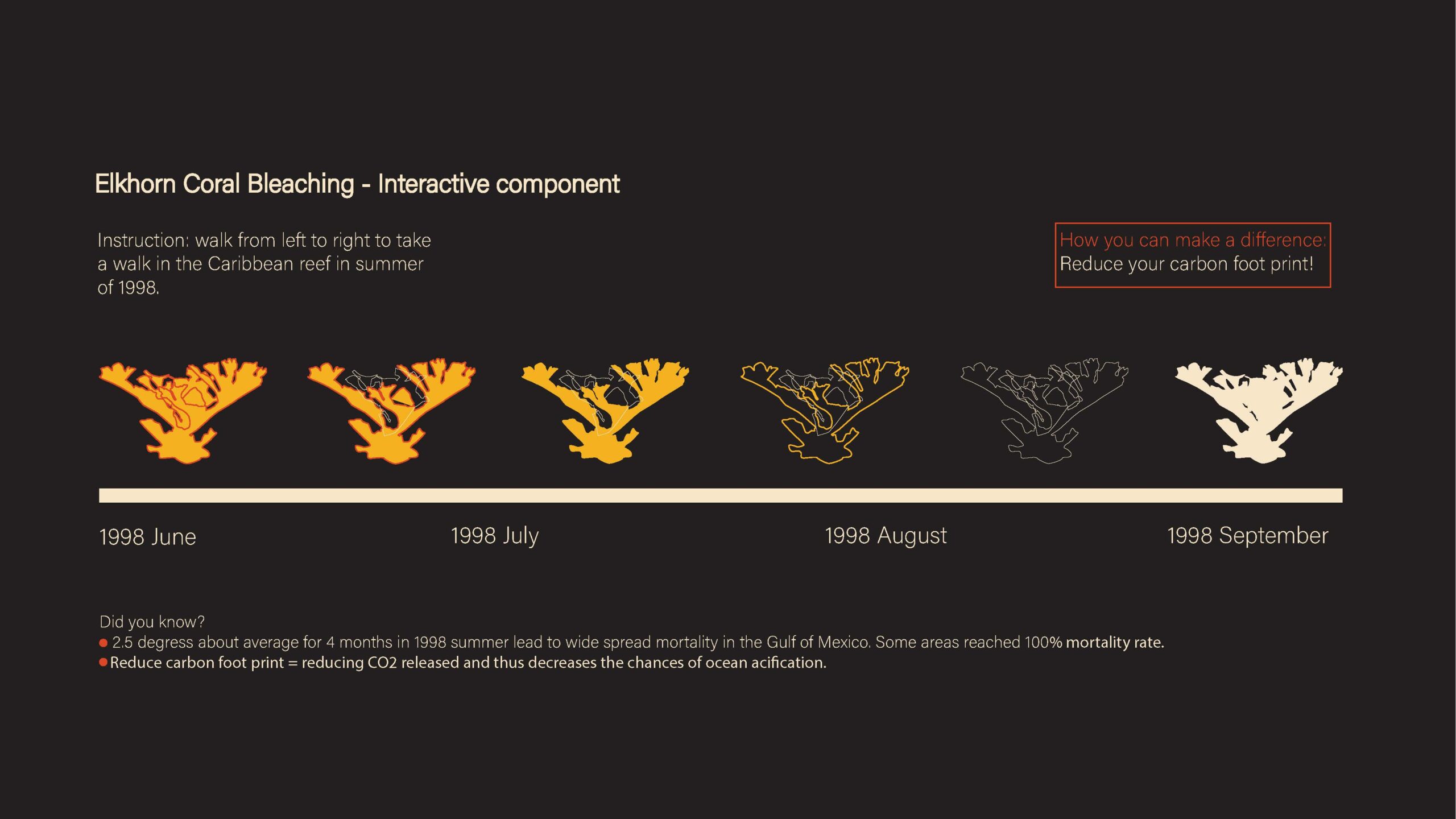
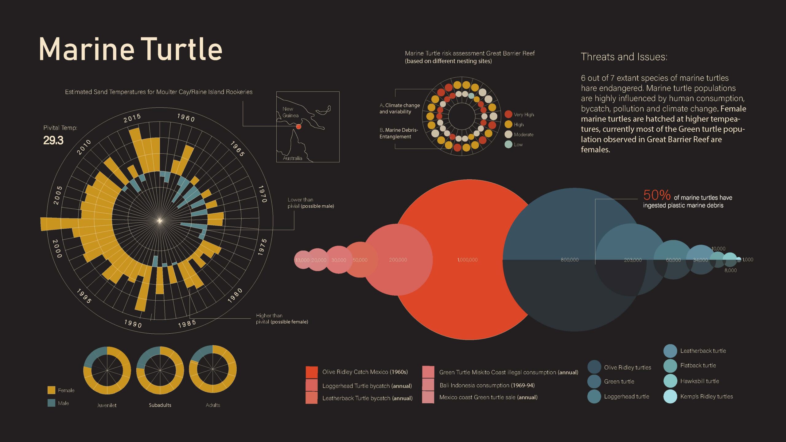
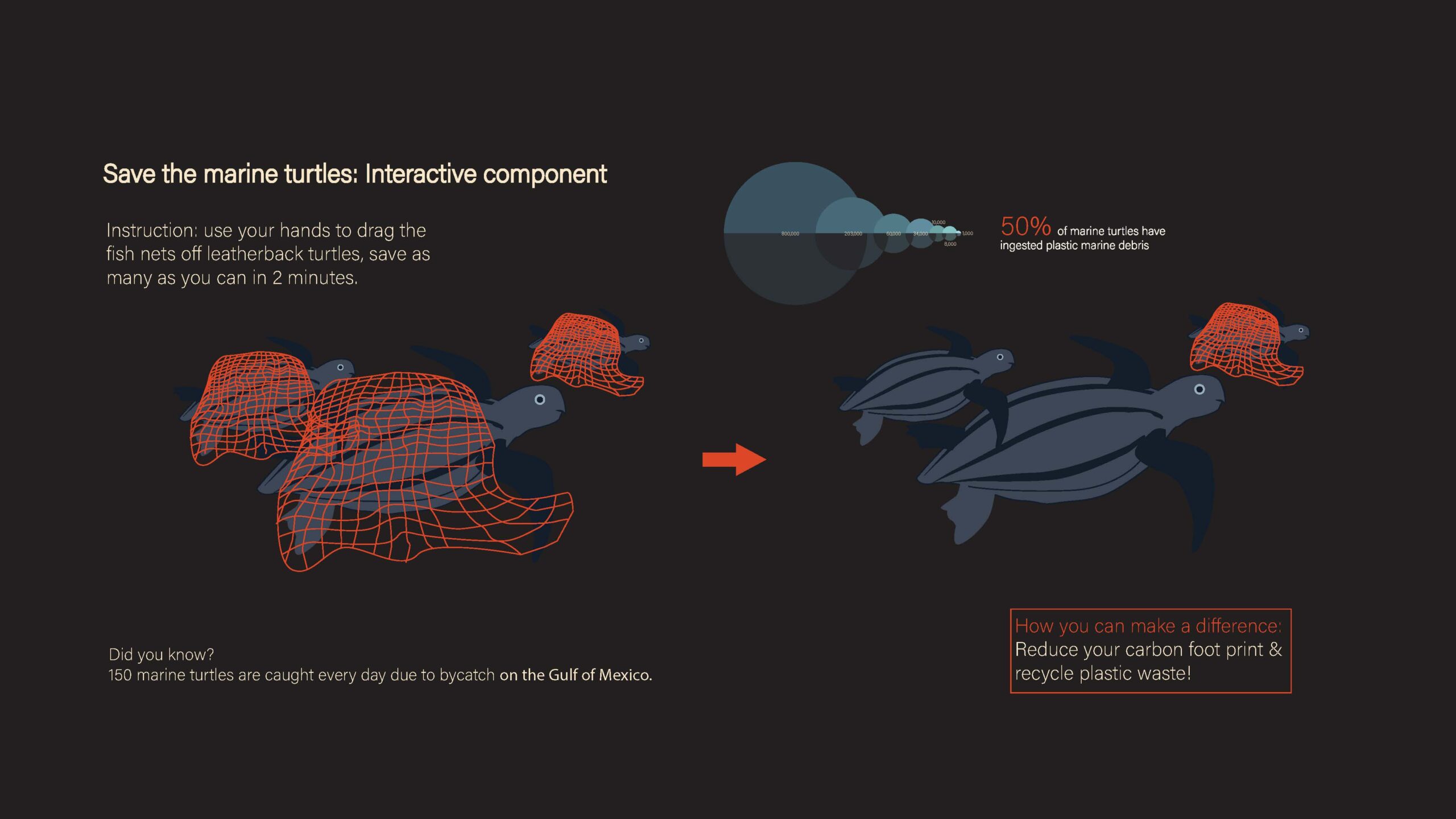
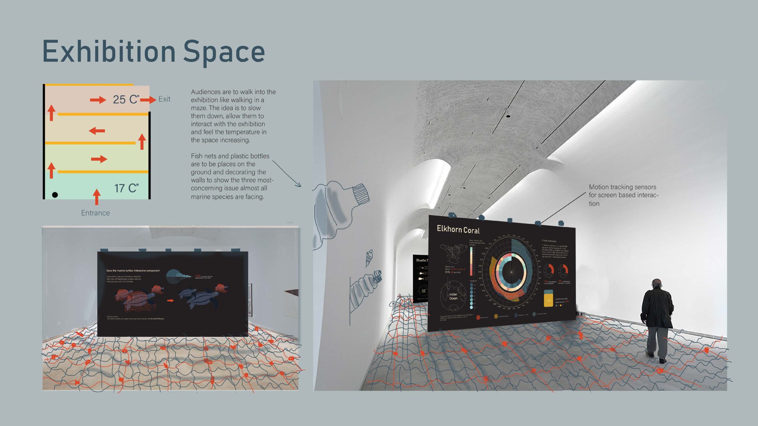
This is supposed to be an exhibition design with interactions after each infographics. The research during this project shocked me the most, Southern bluefin tuna faced a 85.4% reduction in population since the 1973 due to over fishing. I first researched the data, compared different sources and made sure they matched. The data was then calculated and the graphics were manually drawn according to the results. For example, if the circle with the surface area x is 100,000 fish, then 300,000 fish would be 3 times the surface area of that circle.
See more of my works
Asian Meal Kit – Survey writing and analysis
Meditote
Sun Health Clinic
Chinese and Australian Women Artist Exhibitions 2020 -2022